Introduction
Effective poster design supports all viewers in navigating and understanding information quickly. In this guide, you will learn simple design strategies that help your content stand out, feel connected, and guide your audience smoothly through your poster. Plus, you will learn about three accessible design strategies to apply in your poster design.
The four design principles introduced in this guide are:
- Contrast
- Repetition
- Alignment
- Proximity
By strategically integrating these design principles, it will enhance the look of your poster and help your audience better understand the content you’re sharing.
Learning Outcome
By the end of this guide, you will be able to:
- Recognize inclusive visual design principles to improve the clarity, comprehension, and accessibility of academic posters.
Contrast
“If two items are not exactly the same, then make them different. Really different”
(Williams, 1994, p. 53).
If two elements (type, colour, size, line thickness, shape, space, etc.) are not the same, then make them very different so they contrast one another. This creates an organized hierarchy among the elements for your eye to follow (Williams, 1994, p. 53). However, be sure to use contrast sparingly and strategically to make certain elements stand out.
The following video (1.5 minutes) illustrates three ways you can create contrast in your poster design by:
- Varying text size
- Using a combination of dark and colours
- Using shapes in interesting ways
Repetition
“Repeat visual elements of the design throughout the piece. You can repeat colour, shape, texture, spatial relationships, line thicknesses, sizes, etc.”
(Williams, 1994, p. 14).
Repeat visual elements (e.g. fonts, colors, shapes, or spacing) throughout your poster to create consistency and continuity. Repetition makes your poster feel cohesive and helps your viewers navigate your poster efficiently.
The following video (1 minute) illustrates four ways you can create repetition in your poster design by repeating:
- Colour
- Shape
- Spacing
- Line thickness
Alignment
“Nothing should be placed on the page arbitrarily. Every element should have some visual connection with another element on the page”
(Williams, 1994, p. 14).
Humans like to see order as it creates a calm, secure feeling (Williams, 1994, p. 35). Every element placed on your poster should be carefully considered otherwise it can create a chaotic feeling.
The following video (1.5 minutes) illustrates where to consider alignment in your poster design:
- Within a section of your poster
- Within your poster as a whole
For body text, keep it left aligned for the easiest readability. Then, for headings and images, choose one alignment style (e.g. left or center) and use it consistently across each section of your poster.
Proximity
“Items relating to each other should be grouped close together. When several items are close in proximity to each other, they become one visual unit rather than several separate units”
(Williams, 1994, p. 14)
Place related items close together and unrelated items farther apart. When items are near each other, they indicate a relationship and become one visual unit rather than separate pieces. This helps your viewers understand the relationships between elements.
The following video (1.5 minutes) illustrates how to create proximity in your poster design by:
- Placing related items close together
- Placing unrelated items farther apart
Accessibility
The following 4-minute video illustrates three accessible design strategies to apply in your poster design. Creating accessible posters minimizes the exclusion of the poster session attendees.
Conclusion
Posters are an effective way to present academic research visually, but thoughtful design choices are needed to help your audience understand your work. We hope this guide has shown how your design decisions shape the overall experience for your viewers.
Looking for Support with Poster Design?
Visit poster.trubox.ca (opens in a new tab) to learn how to design an effective poster, view templates to download, and read technical instructions.
Connection to Competencies
The Designing Inclusive Posters guide supports the B.C. Post-Secondary Digital Literacy Framework (opens in a new tab) by helping educators and learners create clear, accessible, and visually coherent posters that enhance understanding. This guide aligns primarily with the Creation and Curation competency as it supports learners’ ability to design posters that are clear, effective, and accessible. It also connects to Ethical and Legal Considerations since applying the principles supports accessibility and inclusive design practices that reduce barriers for diverse learners. Finally, it also touches on Digital Scholarship by strengthening the ability to communicate academic and instructional content effectively which supports teaching, learning, and knowledge sharing. Together, these competencies support the creation of inclusive and purposeful posters that communicate a message effectively and are accessible to all learners.
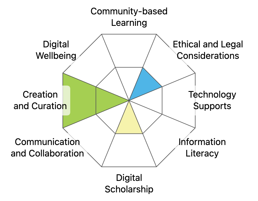
This graphic was created using the “Digital Literacy Framework Competency Stamp Generator” by Luke McKnight, Briana Fraser, and Katherine Cheung and is licensed under CC by 4.0
References
Academic Poster Resources: Accessibility. Yale University Library Research Guides at Yale University. (n.d.). https://guides.library.yale.edu/academic-poster-resources/accessibility
Creating an academic poster: Tips and tricks. Research Guides at Thompson Rivers University Library. (n.d.). https://libguides.tru.ca/academicposters
How can I create a conference poster that is accessible to people with disabilities?. Disabilities, Opportunities, Internetworking, and Technology | DO-IT. (n.d.). https://www.washington.edu/doit/how-can-i-create-conference-poster-accessible-people-disabilities
Williams, R. (2014). The Non-Designer’s Design Book: Design and Typographic Principles for the Visual Novice. (4th ed.). Peachpit Press.