Introduction
Whether you’re creating your own slides or using an open access template, have you considered how the design of each slide impacts the learning experience?
When creating slides, many people focus on making them visually appealing. While that’s important, it’s not always enough to promote learning. Good slide design helps students learn by reducing mental effort and improving comprehension.
This guide introduces four design principles you can apply to your presentations:
- Contrast
- Repetition
- Alignment
- Proximity
By strategically integrating design principles into your slides, you can support learning in a meaningful way.
Learning Outcome
By the end of this guide, you will be able to:
- Recognize inclusive visual design principles that help reduce cognitive load and improve comprehension of PowerPoint slides.
Contrast
“If two items are not exactly the same, then make them different. Really different”
(Williams, 1994, p. 53).
If two elements (type, colour, size, line thickness, shape, space, etc.) are not the same, then make them very different so they contrast one another. This creates an organized hierarchy among the elements for your eye to follow (Williams, 1994, p. 53). However, be sure to use contrast sparingly and strategically to make certain elements stand out.
There are three key ways to create contrast:
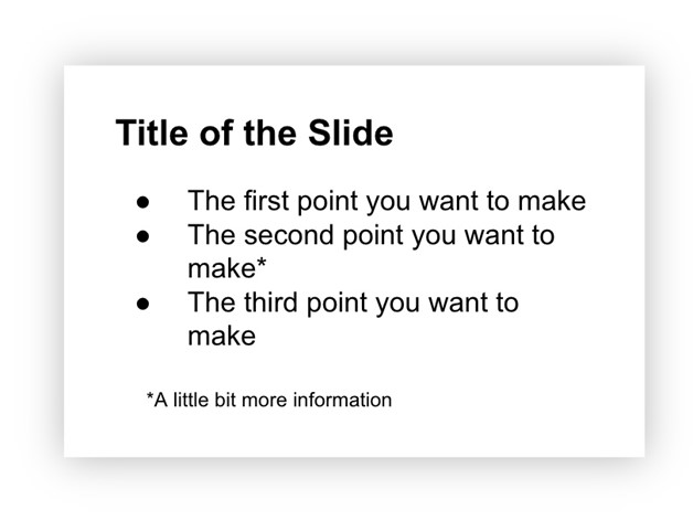
1. Text
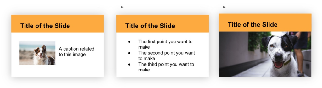
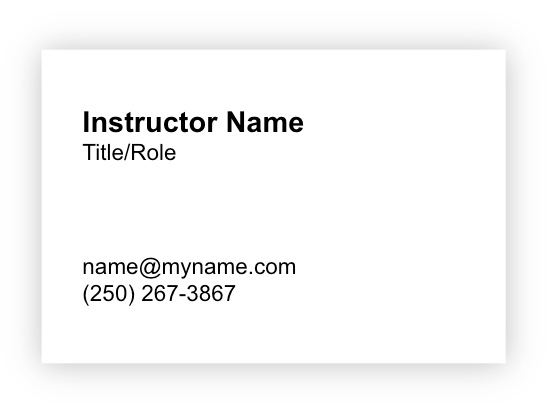
Use large, bold text for titles and smaller text for details. By contrasting large text with small text, you create an organizational hierarchy (Williams, 1994, p. 53). In the example below, a large and bold title naturally draws the eye first, helping organize information and focus attention (Weinschenk, 2020, p. 37). The eye then moves down to the smaller text, which typically contains less important details. This structure signals the importance of concepts and their relationships, allowing students to scan and grasp the content before reading in detail.
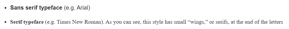
Also, choose typefaces that are clear and easy to read. Both serif (more formal) and sans serif (more casual) typefaces work equally well. Research shows there is no difference in comprehension, reading speed, or preference between the two (Weinschenk, 2020, p. 40).
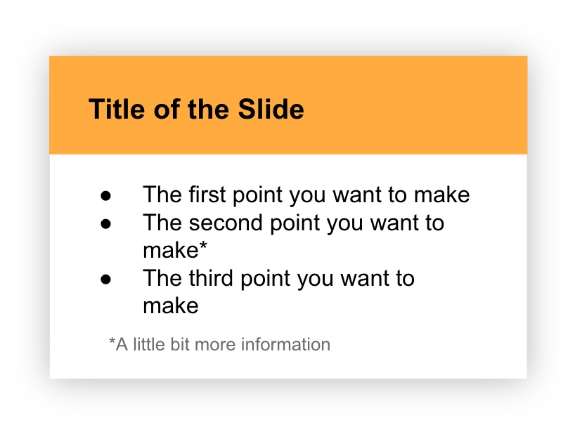
2. Colour
Use color to strengthen visual hierarchy. In the example below, using the same content but adding color transforms the message. The organizational hierarchy now more clearly signals what to view first (the bold, colorful title) and last (the small grey text at the bottom).
Further, keep these color considerations in mind:
- Sufficient contrast: Ensure sufficient contrast between the text and background so all students can read your material with ease. You can use WebAIM’s Contrast Checker (opens in a new tab) to verify your colour choices.
- Purposeful selection: Choose colors purposefully, considering cultural meanings. For example, “in Eastern culture, the colour red means good luck while in most Western cultures red means danger” (Hammond, 2015, p. 23).
- Convey meaning in multiple ways: About 9% of men and 0.5% of women are colorblind so don’t use color alone to convey meaning (Weinschenk, 2020, p. 25). Be sure to provide additional ways to interpret information beyond color (e.g. letters, patterns, symbols, etc.).
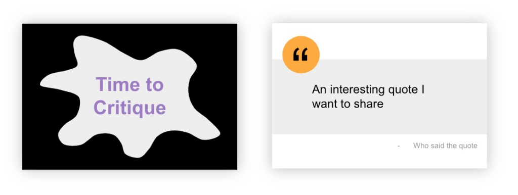
3. Shape
Shapes can be used to create contrast and are often classified as geometric or organic.
Geometric shapes have clear, defined edges that may be symmetrical (e.g. triangles, rectangles, circles, etc.)
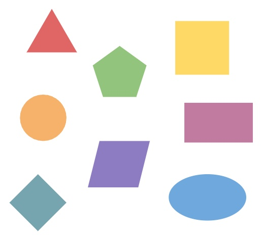
Organic shapes have more natural, flowing, irregular, or asymmetrical edges and often relate to things found in nature.

You can combine geometric shapes (triangles, rectangles, circles) with organic shapes (natural, flowing forms) to create visual interest and draw attention, as illustrated in the following examples.
Check Your Understanding
Repetition
“Repeat visual elements of the design throughout the piece. You can repeat colour, shape, texture, spatial relationships, line thicknesses, sizes, etc.”
(Williams, 1994, p. 14).
Repeat visual elements throughout your presentation to create consistency and continuity. This includes things like fonts, colors, shapes, or spacing. Repetition makes your slides feel cohesive and helps students recognize that all slides belong together.
Example 1
In the following example, the font, colour, and heading style is consistently applied across the slides which makes them feel like they belong together.
Example 2
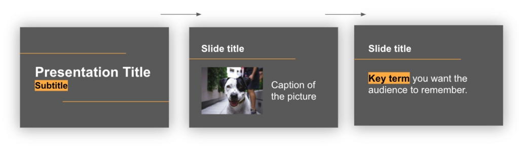
In the following example, slide elements such as a horizontal line, use of highlighted words, and a feature colour of yellow are included throughout the slides in purposeful, consistent ways.
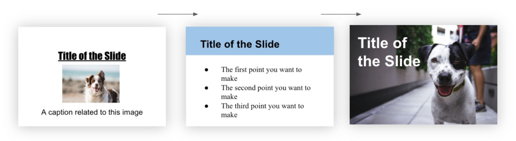
On the contrary, when design elements change drastically from slide to slide, it creates a confusing and disjointed experience. In the following example, the font, colour, and heading style is inconsistently applied across the slides which makes them feel like they don’t belong together. Do you see and feel the difference?
Check Your Understanding
Alignment
“Nothing should be placed on the page arbitrarily. Every element should have some visual connection with another element on the page”
(Williams, 1994, p. 14).
Humans like to see order as it creates a calm, secure feeling (Williams, 1994, p. 35). Every element placed on a slide should be carefully considered otherwise it can create a chaotic feeling.
Choose one alignment style (left, center, or right) and use it consistently across each slide. Left alignment is most common for body text and slide titles and images are often left or center aligned.
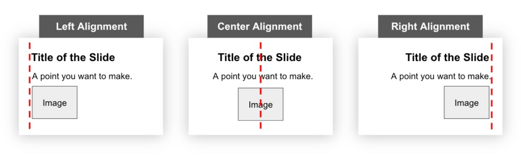
When placing multiple elements on a slide, ensure each element aligns with another on the slide. For example, align elements by their edges (top, bottom, left, and/or right).

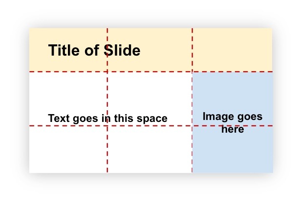
When organizing multiple elements, imagine a grid dividing your slide into columns and rows. Place your titles, images, and text within these sections. This creates balance and clear organization (Goring, 2022).
Example of a slide grid
Example of slide design using that same grid
Check Your Understanding
Proximity
“Items relating to each other should be grouped close together. When several items are close in proximity to each other, they become one visual unit rather than several separate units”
(Williams, 1994, p. 14)
When placing content on your slide, group related items close together. When items are near each other, they become one visual unit rather than separate pieces. This helps students understand relationships between elements.
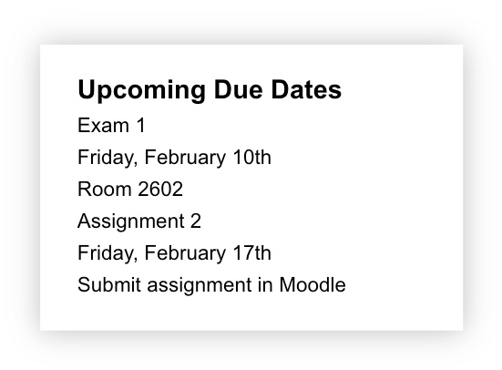
Before considering proximity
Since all the information is all evenly spaced, it doesn’t give us a sense of how the elements work together.
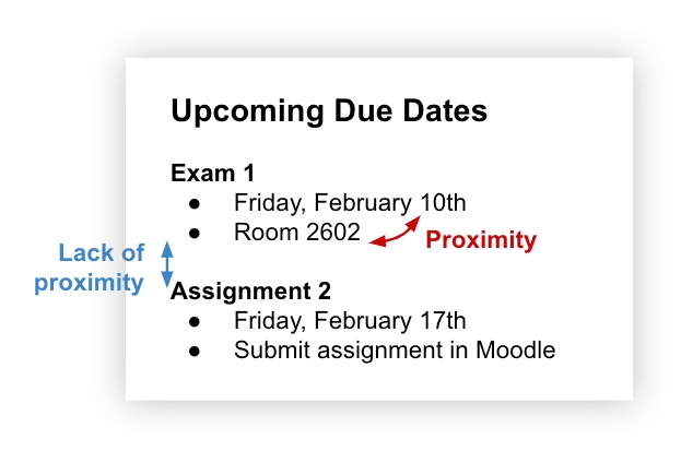
After considering proximity
By grouping related elements together, we understand the first two elements relate to one another and the last two elements relate to one another.
Both closeness (proximity) and distance (lack of proximity) indicate relationships, so use white space intentionally. With no white space, it’s difficult to quickly determine what information belongs together. In the following image, there is no proximity or lack of proximity between any elements so it takes more mental processing to determine what information belongs together.
Using proximity to purposefully create white space gives our brain the necessary space to process and understand how elements on the slide relate to each other.
Check Your Understanding
Conclusion
Presentations are often designed to tell a story about certain content in an interactive and captivating way. But, careful consideration is required when designing it. We hope you see how the design decisions you make when creating slides impact the overall learning experience.
Connection to Competencies
The Designing PowerPoint Presentations for All guide supports the B.C. Post-Secondary Digital Literacy Framework (opens in a new tab) by helping educators create clear, accessible, and pedagogically effective slide decks that enhance student learning. The guide aligns primarily with the Creation and Curation competency, as participants learn to apply visual design principles that increase clarity and reduce cognitive load. It also connects to Ethical and Legal Considerations, since designing inclusive slides requires attention to accessibility standards and equitable learning practices. Finally, it touches on Digital Scholarship by strengthening instructors’ ability to use presentation tools thoughtfully to support teaching and communicate content in ways that improve student engagement and understanding. Together, these competencies support the intentional design of inclusive and effective presentation materials that enhance learning and promote equitable access to course content.
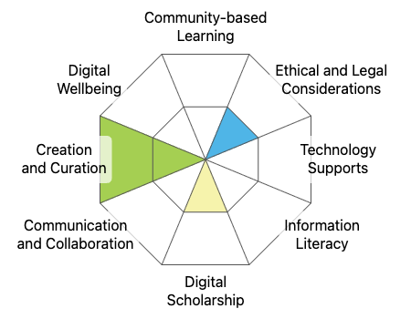
This graphic was created using the “Digital Literacy Framework Competency Stamp Generator” by Luke McKnight, Briana Fraser, and Katherine Cheung and is licensed under CC by 4.0
References
Goring, R. (2022, February 8). Presentation design principles for better PowerPoint design. Bright Carbon. https://www.brightcarbon.com/blog/presentation-design-principles-better-powerpoint-design/
Hammond, Z. (2015). Culturally Responsive Teaching & the Brain: Promoting Authentic Engagement and Rigor Among Culturally and Linguistically Diverse Students. Corwin.
Weinschenk, S. M. (2020). 100 Things Every Designer Needs to Know About People (2nd ed.). Peachpit Press.
Williams, R. (1994). The Non-Designer’s Design Book: Design and Typographic Principles for the Visual Novice. Peachpit Press.
Pictures Used
Photo by Justin Veenema on Unsplash
Photo by Pauline Loroy on Unsplash
Photo by Bruno Nascimento on Unsplash