Introduction
When you create course materials, whether uploading Word documents, PDFs, PowerPoint slides, or authoring content directly in platforms like Moodle or WordPress, you’re designing for a diverse group of students. Your learners come with different abilities, backgrounds, and ways of processing information. Some may use assistive technologies like screen readers or text-to-speech software. Others might have difficulty with certain colors, fonts, or complex layouts.
Post-secondary institutions serve an increasingly diverse student population, with learners varying in information processing, language processing, spatial ability, reading speed, and mathematical calculations (Takacs & Zhang, 2020). Designing accessible content isn’t just about helping students with disabilities—it makes learning better for everyone. When you organize information clearly, use descriptive headings, and provide multiple ways to access content, all students benefit.
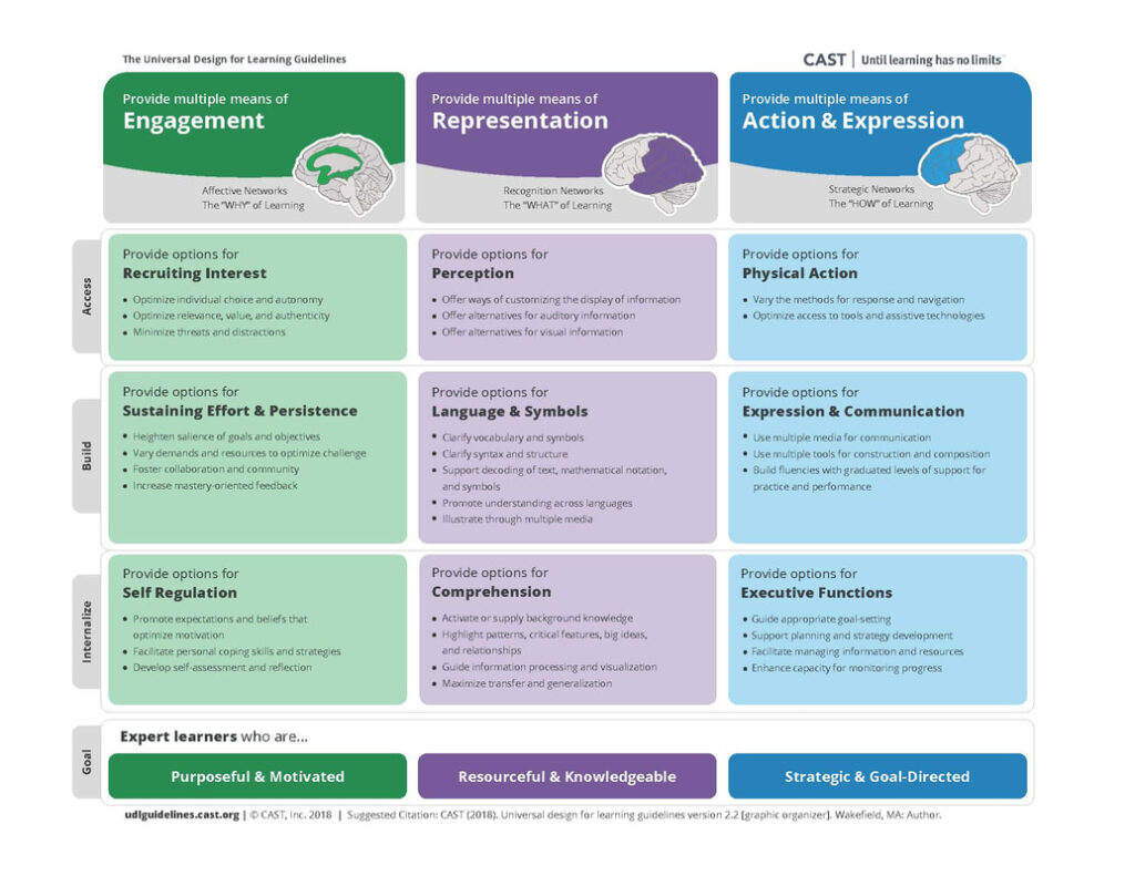
The key is to think proactively. Instead of waiting for accommodation requests, build accessibility into your materials from the start. This approach saves time and creates a more inclusive learning environment. Universal Design for Learning (UDL) serves as a useful framework for this approach, particularly the principle of multiple means of representation. UDL rejects a one-size-fits-all approach to teaching and learning, instead emphasizing flexibility, choice, and access to all students (Pilgrim & Ward, 2017).
Learning Outcome
By the end of this guide, you will be able to:
- Explain accessible design strategies for digital course content that enhance learning for all students.
Understanding Assistive Technologies
Your students may use various tools to access your content. The term “assistive technologies” refers to any item, piece of equipment, software program, or product system that is used to increase, maintain, or improve the functional capabilities of persons with disabilities (Assistive Technology Learning Association).
Screen readers are software that enables visually impaired users to interact with a digital interface with a speech synthesizer or braille display. Screen readers will read aloud content on the screen, including heading structures, tables, links, and images by reading alternative text. Examples include Read&Write, NVDA, Jaws for Windows, and VoiceOver for iOS devices (Friedman, 2022).
Text-to-speech software reads digital or print text aloud. This is useful for learners who have disabilities that affect their reading or attention, are English language learners, are visually impaired, or just simply want to listen to content instead. Examples include Kurzweil 3000, TextAloud, and built-in functionality in Adobe PDF, Microsoft Word, and Google Chrome (Friedman, 2022).
Zoom text allows users to magnify the content on their screen beyond the usual capacity of a computer. It is usually used in combination with text-to-speech software and is useful for learners with poor vision.
You don’t need to master these technologies, but understanding how they work helps you design better content. Consider how someone who cannot view your content would experience it if it was read aloud- this perspective can help identify potential barriers in your materials.
Ask yourself
What assistive technologies are available at my institution?
Structure
“Content headings allow the information to be organized in logical sections”
(Teare & Sparks, 2023)
Organize with Clear Headings
Course content should be well organized in logical sections using headings and sub-headings. This enables learners to identify the structure of your content more easily, understand how concepts are related, and quickly navigate through sections. Clear organization benefits all learners, including sighted students and those with learning disabilities or diminished sight.
Structure your content using proper headings that follow a logical hierarchy:
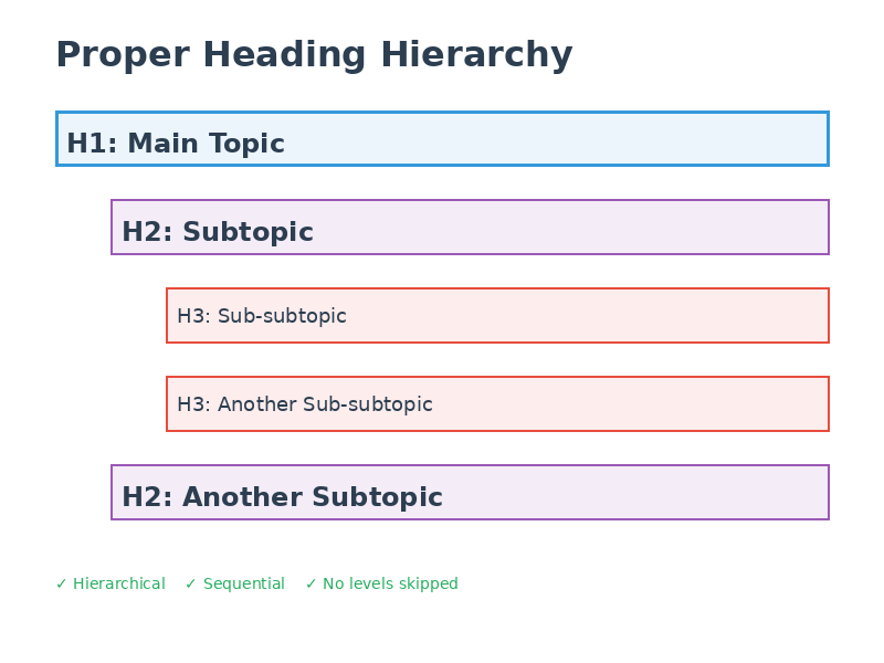
Headings should be hierarchical (nested) and sequential, numbered from 1 to 6 as needed. Lower-level headings should operate as sub-headings of higher-level headings, and heading levels should not be skipped. Use concrete, specific language in your headings so learners know what to expect in that section.
Most importantly, use the actual heading styles in your software- don’t just make text bigger or bold. Screen readers will not identify different font sizes, families, colors, or emphases as headings unless they are properly selected from the heading styles menu. Screen readers navigate by these headings, so proper formatting is needed for accessibility.
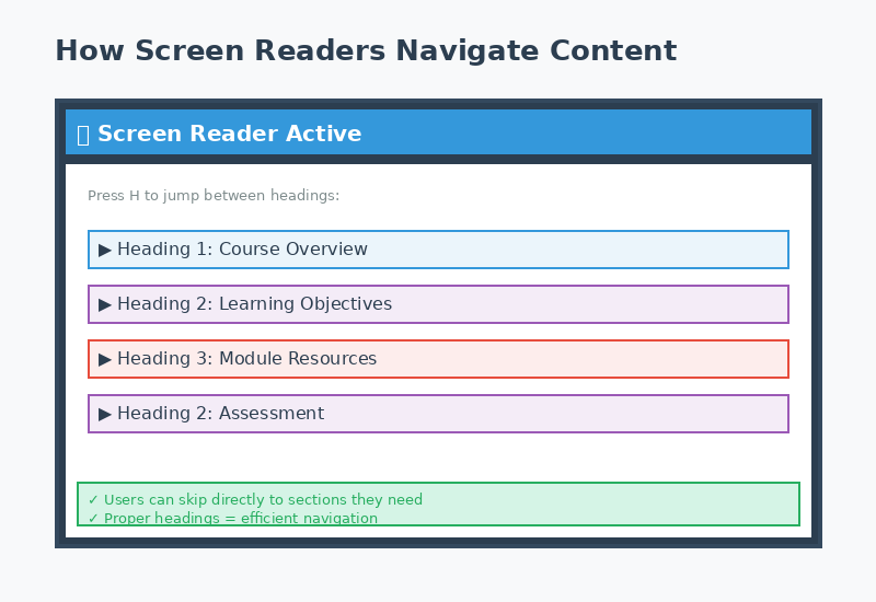
Microsoft has a short (1.25 minute) video (opens in a new tab) that shows how screen readers use headings and how to make headings in a Word document.
Google Workspace has a 19 second video (opens in a new tab) that shows you how to add headings in a Google doc.
Format Lists Properly
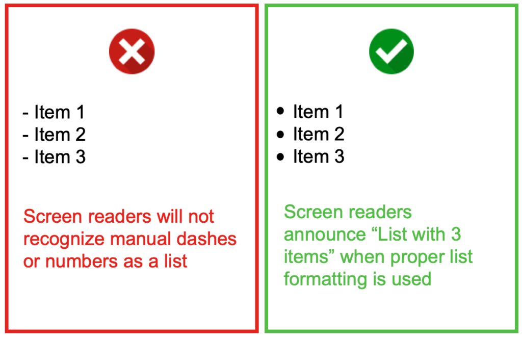
Always use your software’s list tools rather than typing dashes or numbers manually. Although content may visually appear as a list, it will not be recognized as such by assistive technologies unless properly formatted. Screen readers can recognize and navigate nested lists (lists within lists) when they are properly created.
This formatting ensures screen readers can announce the number of items in a list and help users navigate efficiently through the content.
Microsoft has a video and text based tutorial on how to create a bulleted or numbered list (opens in a new tab).
Google has text based instructions for adding a numbered list, bulleted list, or checklist (opens in a new tab).
Check Your Understanding
Visual Design
“People learn better from a combination of words and images than words alone”
(Mayer, 2009)
Make Images Accessible
According to the Principles of Multimedia Learning, people learn better from a combination of words and images than words alone (Mayer, 2009). However, to ensure your content is accessible, images must be interpretable by all learners. Using images to convey information can negatively impact learners who are blind, have poor contrast vision, cannot differentiate certain colours, rely on monochrome displays, have poor internet access, or have cognitive disabilities.
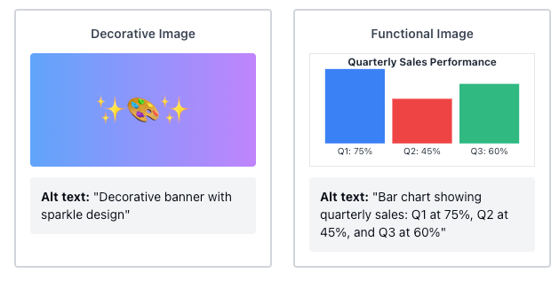
Before adding any image, ask yourself: Is this decorative or does it convey important information?
For decorative images (banner images, design elements, or humorous memes):
- These may not need detailed descriptive text
- Use brief alternative text (alt text) like “decorative image” or a short description
- Don’t leave alt text blank, as screen readers may read the image URL instead
For functional images (graphs, diagrams, illustrations that convey information):
- Add alt text that describes the content and purpose, keeping it under 125 characters
- If the image is complex, provide a longer description in surrounding text or a caption
- Consider numbering images (e.g., “Figure 1”) to make references easier
- Don’t rely on color alone to convey information
- For very complex images, link to a longer description or provide information in additional formats like lists or data tables
When writing descriptive text, convey the content and functionality of the image, not just a literal description. Keep descriptions succinct but accurate. Leave out unnecessary information like “image of” or “photo of” and avoid redundancy with adjacent text (Coolidge, Doner, Robertson, & Gray, 2018).
Use Color Thoughtfully
Color can make your content more vibrant and help convey or emphasize information, but it should be used sparingly and with purpose. Poor colour choices can be problematic for students who are visually impaired, colour blind, have poor contrast vision, or access materials through monochrome displays or printing.
Ensure sufficient contrast between foreground and background elements. Contrast refers to the hue, lightness, and saturation of text, images, and background (Coolidge, Doner, Robertson, & Gray, 2018). The Web Content Accessibility Guidelines (WCAG 2.0) recommends that text and images have a contrast ratio of at least 7:1, with large-scale text requiring a minimum of 4.5:1.
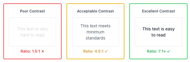
Tools to help evaluate contrast ratios include WebAIM’s Color Contrast Checker, ACART’s Contrast Checker, and Coblis Color Blindness Simulator (Coolidge, Doner, Robertson, & Gray, 2018). You can also check your content in high contrast mode by selecting Left ALT + Left SHIFT + Print Screen on Windows.
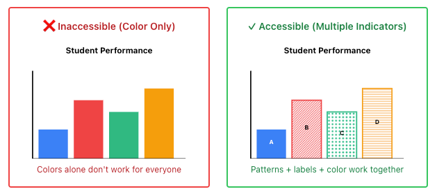
Never use colour as the only means of conveying information. This includes charts, graphs, or highlighting important information. To improve accessibility, use patterns and high contrast colours in graphs, or include text labels and symbols to indicate highlighted information.
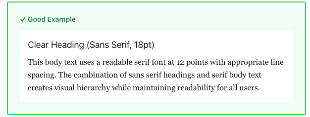
Choose Readable Fonts
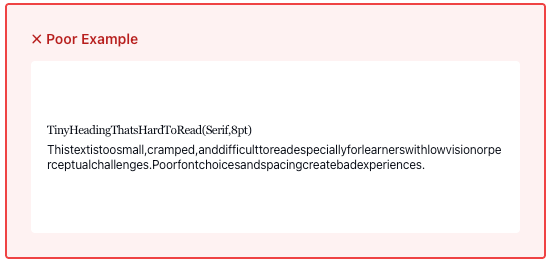
Font choices and size are important considerations for learners with reduced vision or perceptual challenges. Clear, well-spaced text makes documents much easier to interpret.
Font size recommendations:
- Use sizes between 10-14 points for online viewing
- Ensure text can be zoomed to 200% as recommended by WCAG 2.0
- Consider that platforms like Moodle and WordPress have default paragraph sizes
Font selection principles:
Use one type of font for headings (e.g., Sans Serif) and the opposite for body text (e.g., Serif). Be consistent in font choices throughout your document
- Serif fonts (with extending strokes) are acceptable for display with modern operating systems and browsers
- Sans serif fonts (without extending strokes) often work well for headings
(Penn State Accessibility)
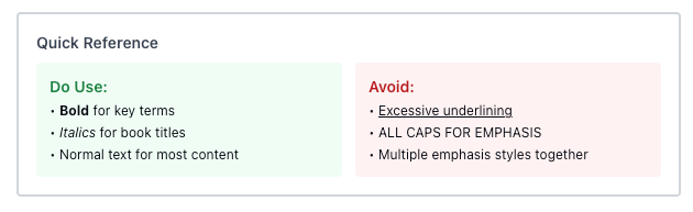
Use emphasis sparingly:
- Reserve bold for emphasis of key concepts
- Use italics only for titles of works, terms used abnormally, or field-specific requirements
- Avoid excessive italics, which can be difficult to read online due to resolution issues
Check Your Understanding
Links & Tables
“Everyone, including you, is using the design that you created”
(Takacs, Zhang, Lee, Truong, & Smulders, 2021)
Create Meaningful Links
Ensuring that hyperlinks contain meaningful context is critical for enhancing accessibility for students with various disabilities and challenges. Screen readers identify hyperlinks much like they do headings, announcing “link” and then reading the visible linked text.
Poor linking practices
Pasting long URLs directly in text
Example
You can access TRU Accessibility Services Resources at: https://www.tru.ca/current/academic-supports/as/resources.html.
Using vague phrases like “click here” or “read more”
Example
Click here to access resources from TRU Accessibility Services.
Links that lack context about destination or purpose
Example
If this interests you, learn more here.
Better linking practices
Use descriptive text that explains the purpose and destination
Example
Be sure to check out TRU Accessibility Services Resources for additional tools and tips.
Include relevant formatting information (Word document, PDF, etc.)
Example
Take a look at TRU’s Accessibility Services Education Within Reach PDF
If links open in new tabs, mention this to avoid disorienting readers
Example
Be sure to check out TRU Accessibility Services Resources (opens in new tab) for additional tools and tips.
Note: If a document is intended to be printed, include full web addresses for reference.
If you have time, watch the following short video titled Why Use Descriptive Links? (4:37) by Portland Community College for an example of why using descriptive links is so critical for screen readers.
Design Simple Tables
Tables should be structured to be easily readable and accessible to those with cognitive disabilities or who use assistive technologies. Screen readers read tables left to right, top to bottom, one cell at a time, so proper structure is essential.
When to use tables:
- For numerical data or information that fits efficiently in a matrix layout
- To provide visual organization of information in a condensed way
- Avoid using tables merely for layout purposes
Best practices for accessible tables:
- Keep tables simple when possible
- Include clear caption titles to orient readers
- Use proper column and/or row headers with correct scope assigned
- Avoid blank, merged, or split cells as they disrupt reading order
- For lengthy tables, consider including skip options
- Consider providing information in both table and list formats for choice
If you have time, watch the short video titled Why Use Accessible Tables? (7:59) by Portland Community College for examples of how poorly formatted or complex tables can impact accessibility for assistive technologies.
Check Your Understanding
Conclusion
Accessible design is good design. When you create content that works for students using assistive technologies, you’re also creating content that’s clearer, better organized, and easier for all students to navigate. This benefits everyone in your course and creates a more equitable learning environment where all students can fully participate.
Connection to Competencies
The Formatting Course Content so it’s Accessible guide supports the B.C. Post-Secondary Digital Literacy Framework (opens in a new tab) by developing educators’ capacity to design and structure digital course materials that are inclusive, navigable, and accessible to all learners. This guide most directly aligns with the Ethical and Legal Considerations competency since it helps instructors understand their responsibilities to provide equitable access to educational content and meet accessibility standards and legal requirements. It also enhances Creation and Curation by building practical skills in creating well-structured, accessible documents and organizing content for diverse learner needs. Finally, it strengthens Digital Scholarship as participants learn how thoughtful formatting and universal design principles support learning effectiveness and academic success for all students. Together, these competencies empower instructors to create course content that removes barriers to learning, supports diverse access needs, and reflects a commitment to inclusive educational practice.
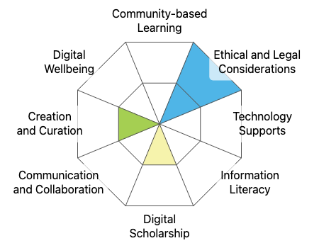
This graphic was created using the “Digital Literacy Framework Competency Stamp Generator” by Luke McKnight, Briana Fraser, and Katherine Cheung and is licensed under CC by 4.0
Module References
Assistive Technology Learning Association (n.d). What is AT? Retrieved from https://www.atia.org/home/at-resources/what-is-at/.
Coolidge, A., Doner, S., Robertson, T., & Gray, J. (2018). Accessibility toolkit – 2nd edition. BCcampus. https://opentextbc.ca/accessibilitytoolkit/
Friedman, H. (2022). OER Production Series: Technical Accessibility [Webinar]. Retrieved from https://bccampus.ca/event/oer-production-series-technical-accessibility-in-oer-2/.
Mayer, R. E. (2009). Multimedia learning (2nd ed.). New York, NY, US: Cambridge University Press.
Pilgrim, J. L., & Ward, A. K. (2017). Addressing diversity through the Universal Design for Learning lens. In Addressing Diversity in Literacy Instruction (pp. 229-249). Emerald Publishing Limited.
Takacs, S., Zhang, J., Lee, H., Truong, L., & Smulders, D. (2021). Universal design for learning: A practical guide. JIBC. https://pressbooks.bccampus.ca/jibcudl/
Teare, C., & Sparks, C. (2023, March 10). Accessibility…One Step Closer. https://onestep.trubox.ca/accessibility-tour-elements-of-accessibility-headings/